Tag lines
quick, strategic bursts of branding for print & digital assets

a wardrobe that works
I created this tagline to emphasize the versatility and cohesiveness of the complete wardrobe. Playing with the double meaning of “works” reflects the brand’s spirit of clever fun.


MADE FOR MAKERS
The tagline we launched with, I created it to speak directly to the trend of the “Maker” movement and to celebrate our customers as women who make things happen in the world. Aligning with makers felt especially appropriate since we launched on Kickstarter, a fundraising platform popular with creatives.
Less waste, more styles.
For the homepage slideshow my goal is to entice, describe, and delight in the quick-fire pace of online browsing. Here I use the familiarity of “less is more” to immediately speak a common language with website visitors.

Couch comfort, meet office style.
Again, for the quick pace of online browsing I used familiarity–everyone has a “couch feeling” and an “office look” in their minds–to bypass a lot of explaining. The a-ha moment is that this product unites the two.

Pockets Performance + Perfect fit
All 3 elements of the tag are unexpected finds at the more fashion-focused events I created this tag for. Thousands of potential customers came through these events and I jockeyed for attention with hundreds of other brands. I went with quick, punchy alliteration for easy reading and showcased the qualities that made The Willary stand out from the crowd.
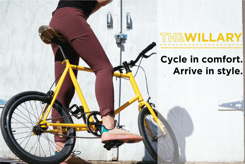
cycle in comfort. arrive in style.
A tagline for cycling-specific events. Most women’s wear at cycling events is purely functional, the kind of clothes you need to change out of when you get to your destination. I created this tagline to differentiate us from our competitors on the floor.